
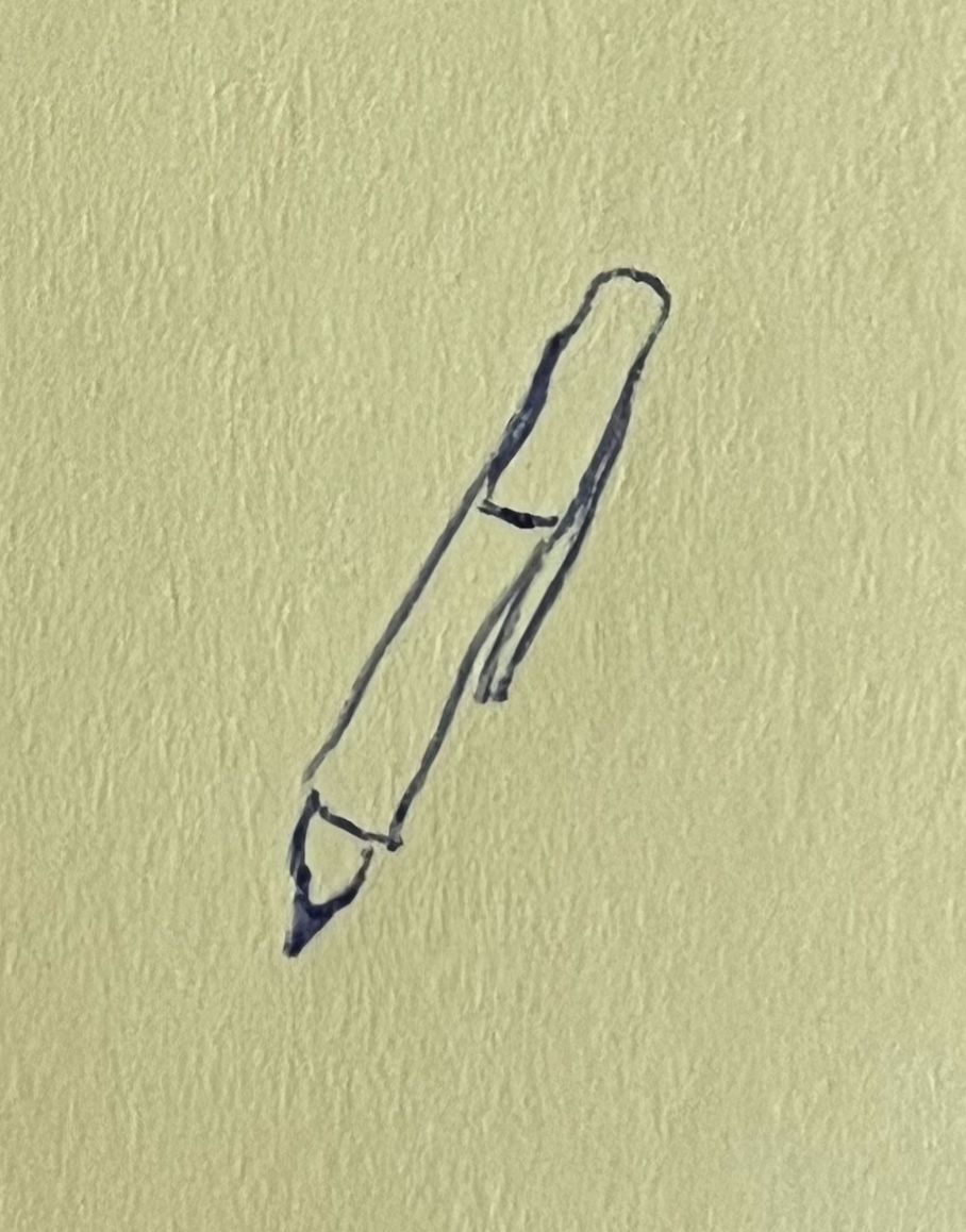
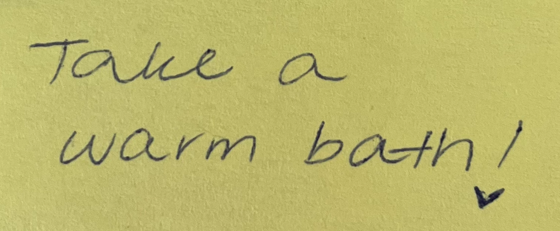
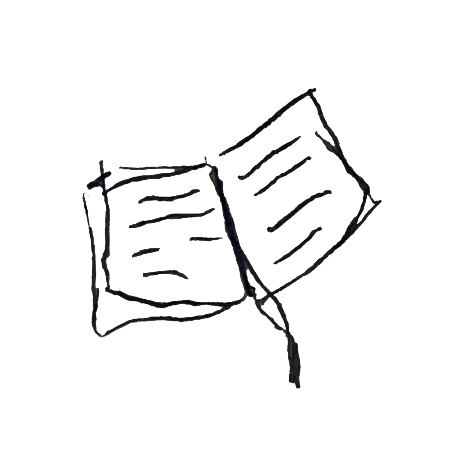
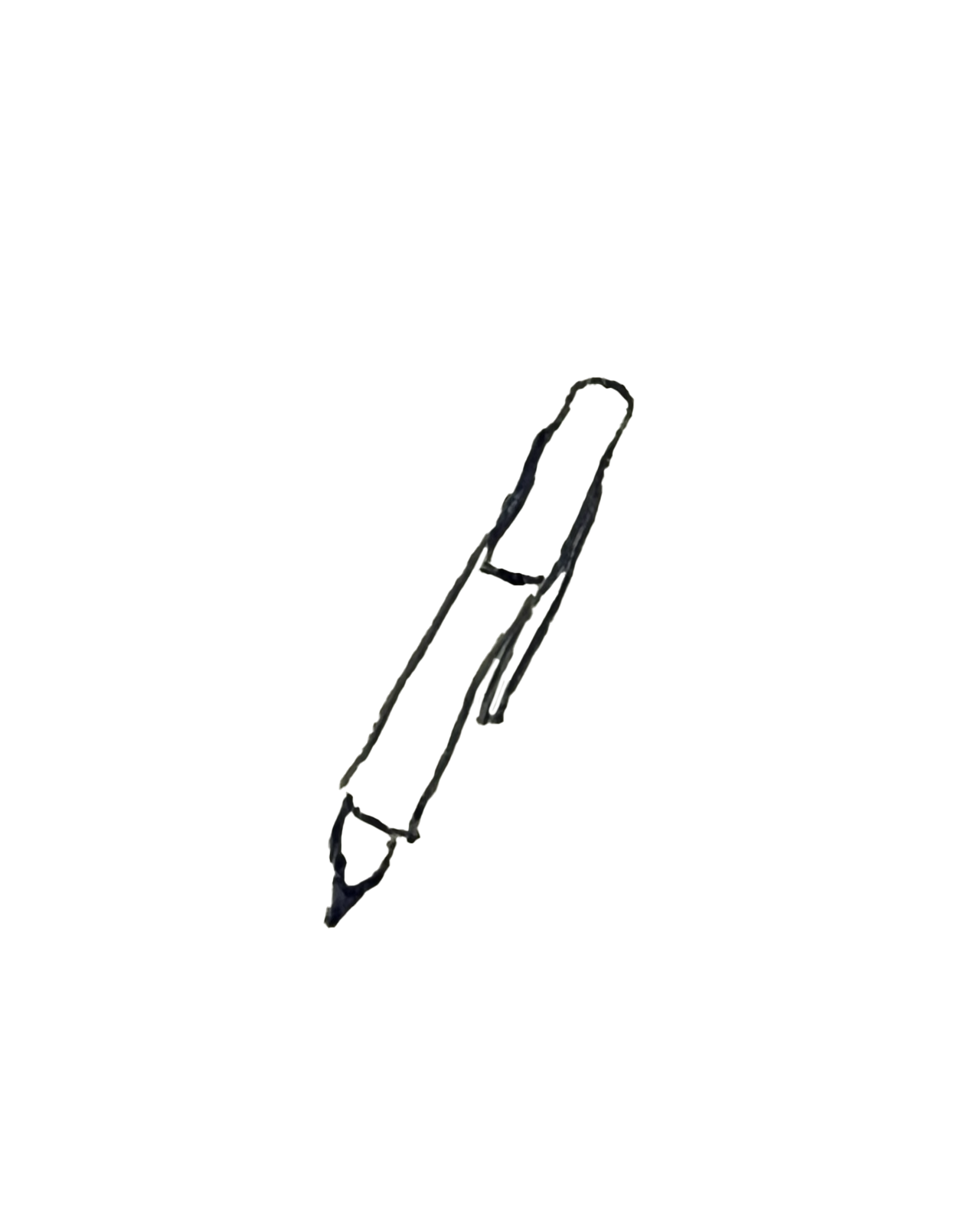

Instead of vectorizing my drawings, I decided to remove the background and keep the outlines rough for an imperfect, collage effect
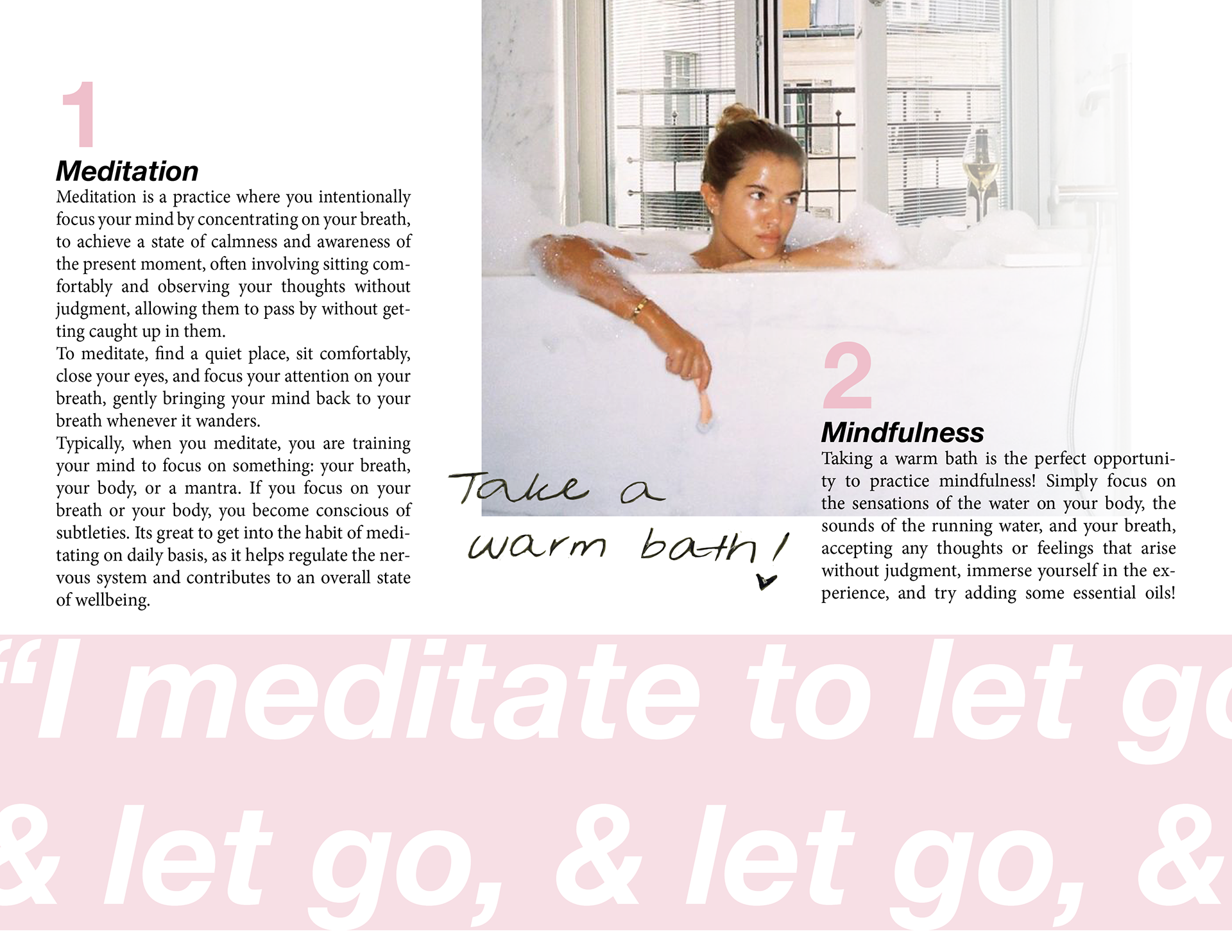
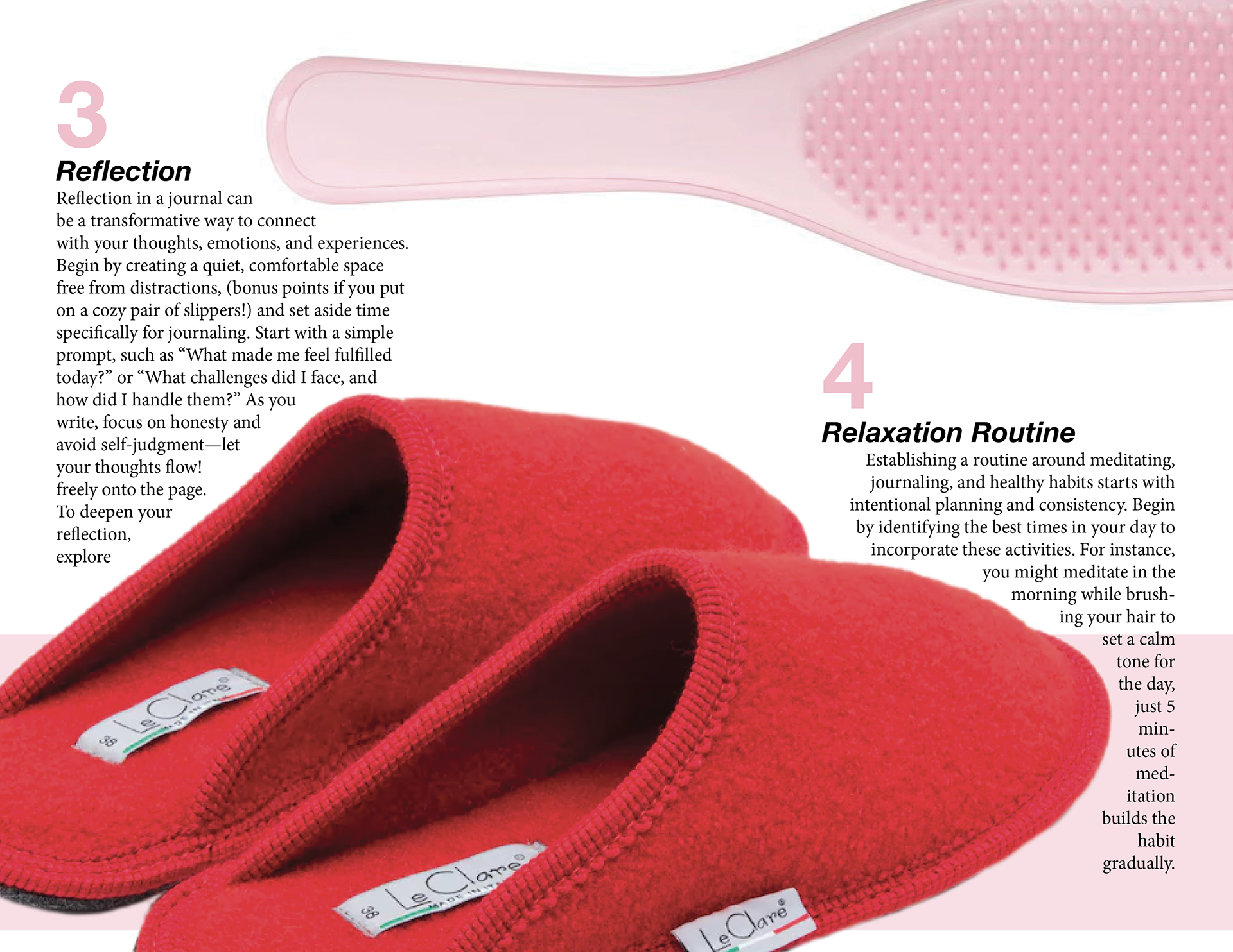
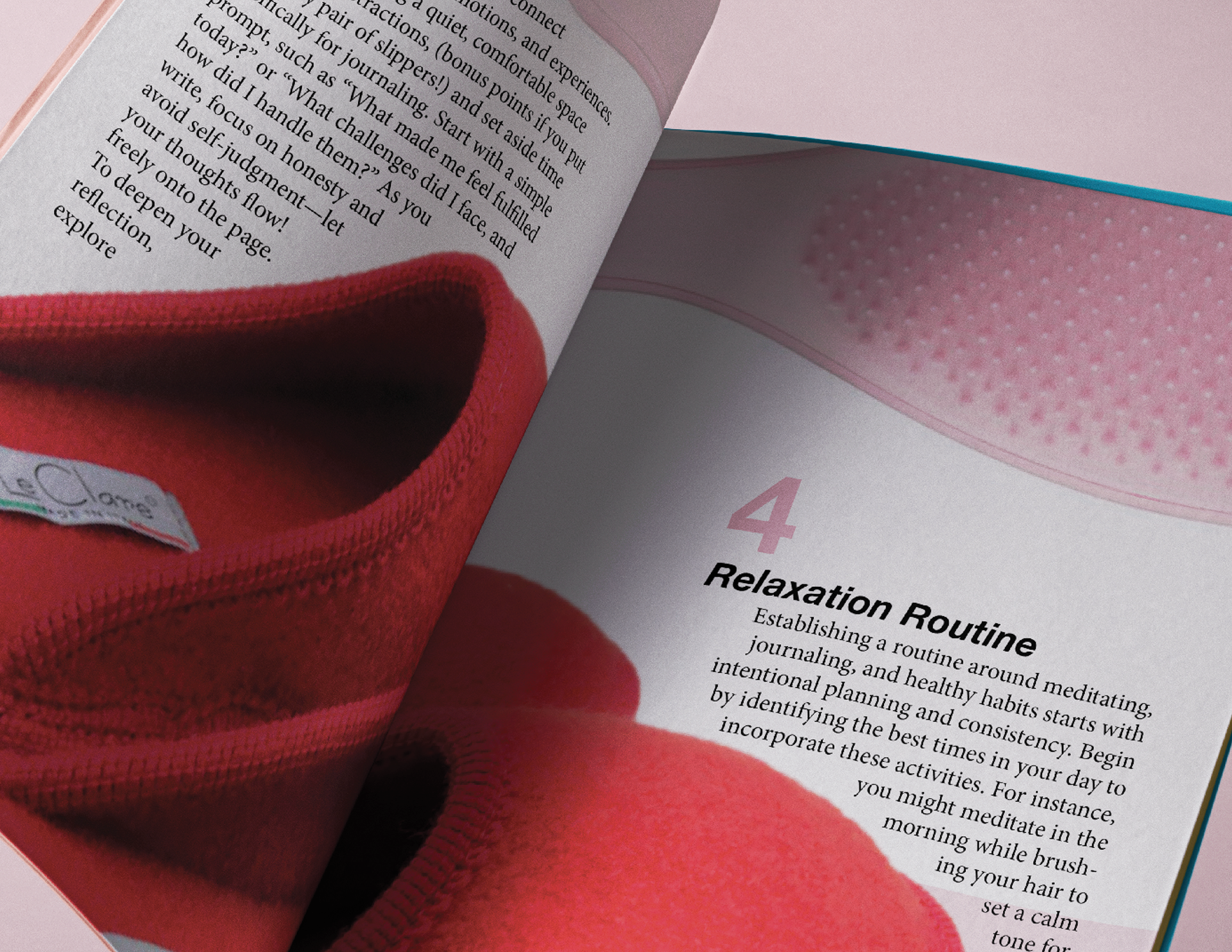
Building on the concept of self-care, this 6-page editorial magazine features a clean layout, a cohesive pink color palette designed to engage its audience, and minimalist typography that enhances the overall aesthetic. Utilizing the grid, I ensured horizontal and vertical alignment. I also included my original hand-drawn editorial illustrations to create playfulness and visual interest against the bold type.